FROM THE HOMEOWNERS:
Our 1978 house had a unique feature which we hadn’t seen in other homes built in the same era: a vaulted ceiling which leads up to the living room framed by soaring arches. There was one Achilles heel, however. The connected kitchen was very small and even worse, was enclosed on 3 sides by walls, further limiting the usable space. It also had only an arm’s length worth of counter space, which could only lead to marital strife during team-cooking sessions!
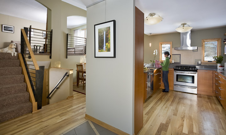
We enlisted the help of Otogawa-Anschel Design-Build, who were able to design a spectacular space within the existing footprint while somehow transforming the entire house! We now have wonderful storage, counter space, clever built-ins and custom- designed Cambria countertops and bar. When you step past the front door, your eye follows the striking angles of the tile floor through the kitchen and the natural elm floors, up the stairs to the modern black iron railings, which complete the flow of the house. The best part is how much strife was avoided by our investment!

FROM THE REMODELER:
When homeowners Eric and Christina purchased their split level home in Mounds View, they loved the neighborhood and the additional square footage. However, the kitchen was an eyesore. Upon entering the home, one was confronted with a small, dark enclosed kitchen cut off from the rest of the house. Whenever the family wanted to entertain, the cook would be isolated from the guests and excitement. The awkward situation prompted them to call Otogawa-Anschel Design-Build for an eco-friendly design solution that better fit the family’s lifestyle.
The homeowners wanted a contemporary kitchen that possessed optimal storage solutions, supported the entertaining of guests and allowed for an abundance of natural light. They desired all of this without adding to the original footprint of the home. It was also important that this project have energy efficient appliances and use sustainable materials.
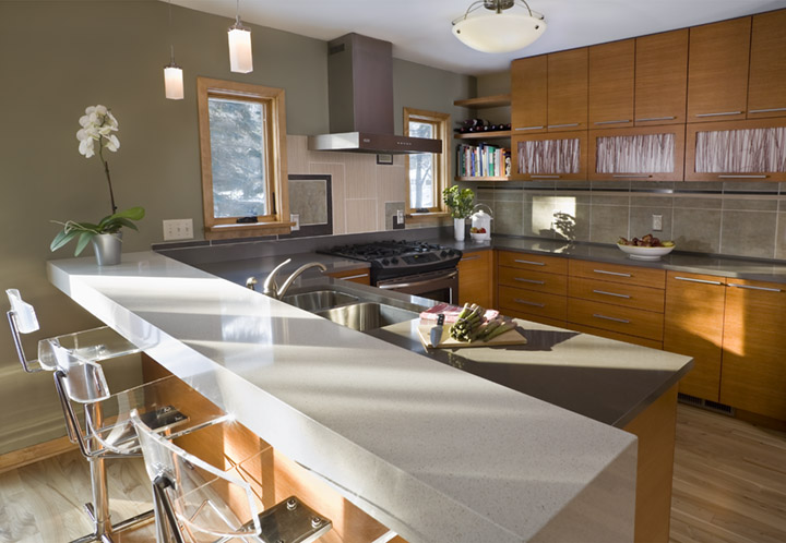
Otogawa-Anschel Design-Build dramatically improved the function and flow of the entire first floor by removing the interior walls of the kitchen, brightening the area during the day and creating multiple opportunities for hosting in the evening. Now the kitchen is open to the dining room and even to the living room beyond. Bar seating allows the chef and guests to interact. A narrow free standing wall placed between the entryway and the kitchen creates an entry space on one side and a well situated storage center on the other while both areas feel open and spacious.
Proving that green design can be cool and stylish as well as functional, the project boasts eco-resin panels set within the cabinets add a clean vertical counterpoint to the horizontal rift-cut wood and sleek minimalist hardware pulls. The white Cambria split counter block diverges from the straight line of the cabinet wall and adds personality and flare to the home.
Our firm’s Green solution includes cabinets which are custom-made locally with FSC-certified no-formaldehyde-added white oak. The floor is locally reclaimed elm (from trees felled by Dutch Elm Disease). We used recycled-content tile and locally produced Cambria countertops. All paints and stains used were low VOC. The appliances are all Energy Star rated.

Highlights
- Energy Star rated appliances
- Eco-resin panels on upper cabinet doors
- Recycled-content tiles
- Locally-made custom Cabinets
- FSC-certified, No-formaldehyde-added rift cut oak
- Water-based finishes
- Reclaimed local elm flooring
- Custom-designed and locally-made steel railings
- Minnesota-made Cambria counter tops
- High efficiency Marvin windows & patio door
- High efficiency lightning
- No VOC paints and primers
For more information on this project visit www.otogawa-anschel.com.


